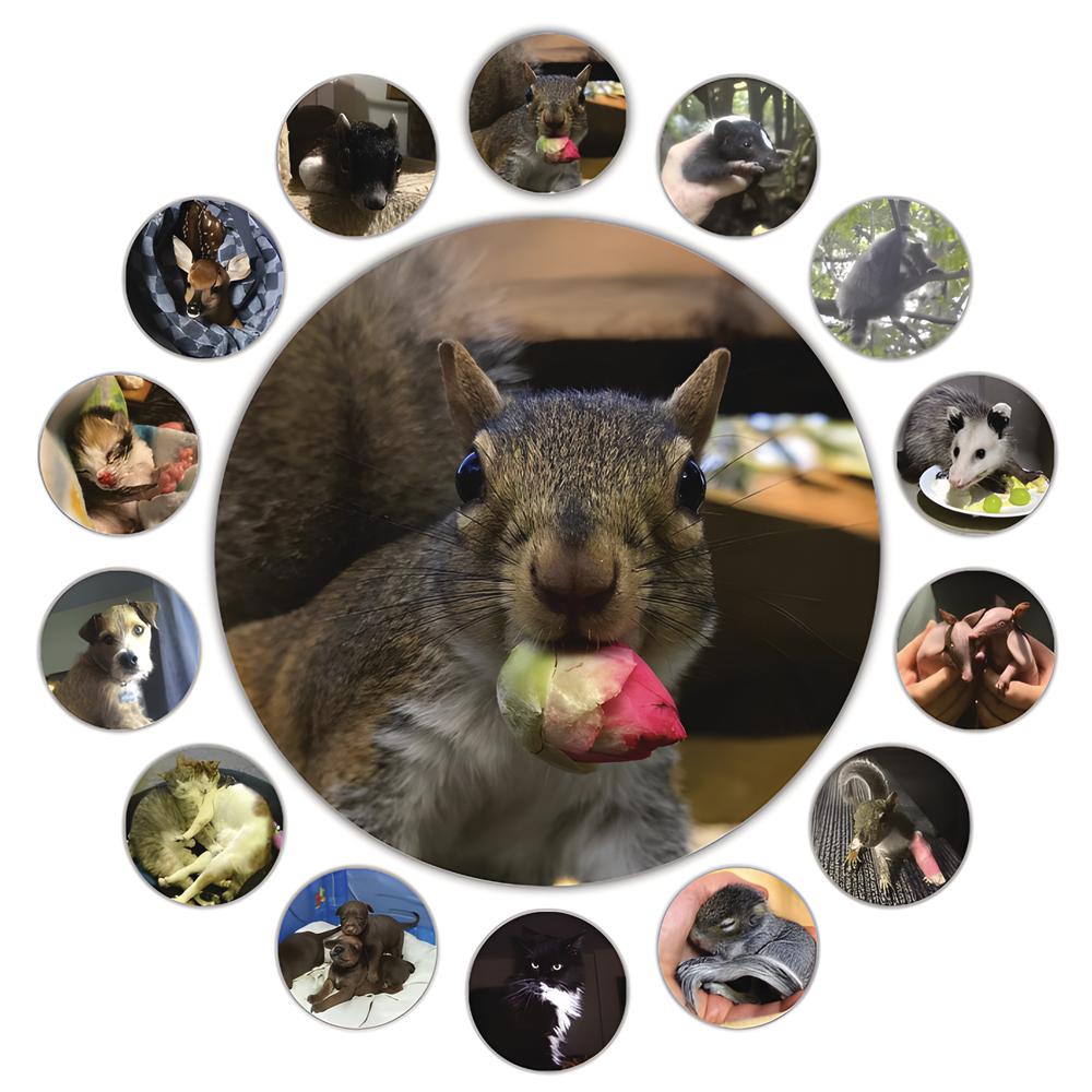
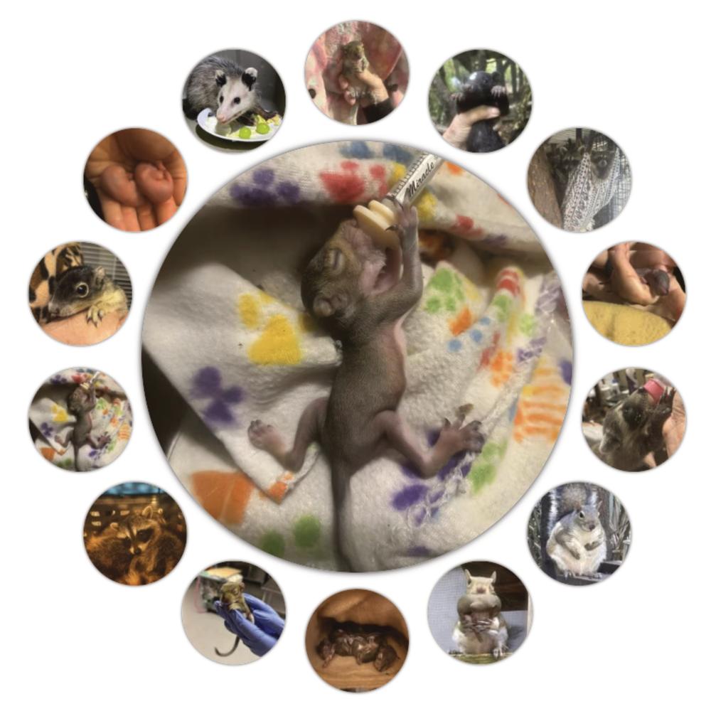
Circular Image Gallery
Trying something a little different
It’s always fun to experiment with different ways of presenting and the coding to make it happen


The fun bit
The cute images, of course, but the other fun bits are described below
Getting it together
The features
- The circular thumbnail surround is the primary feature. There’s a ResizeObserver on the container that triggers the thumbnail layout change from a horizontal scroll below 500px and the circular surround above 499px.
- The translations and rotations are determined by the container size and the number of thumbnails.
- The circular surround only displays if there are from 7 to 15 images.
- There is an option for the feature image to update on a user-determined interval or not at all.
- Clicking on the feature image will advance it to the next image and pause the auto advance (if set) for 10 seconds.
- Clicking on a thumbnail will set that image as the feature and also pause the auto advance.
The block itself
This blocks renders the front-end through render.php in combination with a front-end script in view.js with the edit panel rendered through edit.js. In this case, the block allows only for adding custom Circular Image Gallery Image sub-blocks as children which save.js returns as children from InnerBlockProps saved with BlockProps.
Tempted to do more
- It’s always tempting to give more options, but in the interest of time, I chose the smaller subset of features. A couple of the features I considered:
- giving the user the option to choose the cut-off width for displaying the circular surround, including the option to display it at all widths
- making the feature image click location aware so that clicking the right side would highlight the right side and show the next image and clicking the left side would highlight the left side and show the previous image